A better way to visualize what’s on our networks?
This post is the first of 3 about CRviz, a network visualization tool developed by Cyber Reboot.
We’ve realized that one of the dirty secrets of the Information Technology world is that when it comes to networks of a significant scale (i.e., 10k nodes or greater), defenders often operate without essential information. What nodes are on the network? What roles do they play? In what ways are nodes similar, unique, or related to one another? If defenders can’t answer these basic questions with certainty, what else goes unnoticed?
In previous posts, we’ve described our efforts to improve network situational awareness through data collection approaches like Poseidon and tools like Vent. But we know that collecting better data isn’t enough — we also need more scalable and intuitive ways to explore and interact with this data. So we asked ourselves: can we help defenders know what’s on their network by designing a better way for them to see what’s on their network?
This question inspired the development of a visualization tool — CRviz — intended to improve users’ understanding of the assets in a computer network, by helping them to see and explore those assets.
In this first post we describe the problems we see with a commonly used network visualization technique, the force-directed graph, and suggest the enclosure diagram as an alternative. In an upcoming post, CRviz: Scalable design for network visualization, we will explain the design strategies we used to improve scalability and legibility in our tool. And in CRviz: Initial release we will show you how the tool works, where and how you can access the code, and how you can easily try out the tool for yourself.
Better than a “hairball”?
When we began exploring approaches to visualizing network assets, we couldn’t help but notice how many tools in the cyber domain render or represent computer networks as graphs. Typically, these tools show a collection of nodes (representing network assets or devices) that are connected by edges or “links,” (representing anything from physical connections to firewall rules, traffic patterns to routing tables, shared characteristics to ping data, etc.)
Many of these visualization tools leverage a class of “force-directed” layout algorithms that use physical simulations to position nodes in two or three-dimensional space and that are optimized to minimize edge crossings. These visualizations can look cool, and when networks are small and sparsely-connected, the technique works quite well. However, as networks become larger and more complex, maintaining legibility is challenging. Despite their popularity and ubiquity on the internet, these force-directed graph visualizations are increasingly critiqued both for lacking information value and for looking like incomprehensible “hairballs.” What’s wrong with a hairball, you ask? Well, when it comes to understanding the devices on your network, pretty much everything.
First, in a force-directed layout, the position of nodes is determined by the connections between them. This means that decisions about what constitutes a “link” determine what kind of structure the (visualized) network will have and even minor changes in the data can drastically alter the appearance of the visualization. Without a fixed visual reference point, it is nearly impossible for humans to use this type of display to make a visual comparison of different states of the network. (E.g., Discovering when new nodes have appeared is confusing at best, impossible at worst.)
Additionally, the same network data can look very different, depending on parameter settings. Not only does this make it challenging to compare visualizations produced by different tools, but it can also be surprisingly difficult to distinguish visual “patterns” in the data from artifacts of the layout algorithm. Martin Krzywinski provides several visual examples to highlight these problems at hiveplot.com.
Even more problems emerge when one tries to use this technique to visualize multiple types of links at once. Using a force-directed graph layout creates such a complicated “base map,” with so much visual clutter that it is difficult to layer additional information onto the visualization. The sheer number of lines can make it difficult to see what’s going on and overlapping lines of different types make it difficult to correlate different types of connections. A scalable network visualization tool should help users display, correlate, and understand different types of information about what’s on a network. But even with two types of connectivity data, the force-directed graph representation breaks down, becoming so complicated that it is essentially illegible.

With all of these shortcomings, why is the force-directed graph — the “hairball” — the de-facto standard for visualizing assets on a network? We don’t know. But fortunately there are alternatives, including one simple and powerful technique called an “enclosure diagram.”
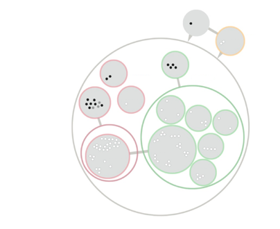
A visual hierarchy to show network hierarchy.
An enclosure diagram is a visualization technique that uses containment to represent hierarchy. A popular implementation can be found here in Mike Bostock’s D3 “circle packing” layout.
Unlike a force-directed graph layout, where overlapping links can create so much visual clutter that the resulting display becomes unintelligible, an enclosure diagram organizes elements into a neat visual hierarchy of groups and sub-groups, each defined by various attributes. For our CRviz tool, we set out to build a flexible, interactive implementation of this visualization technique. When users select attributes of interest, we want the tool to auto-generate an interactive network “map” that groups assets according to these user-defined attributes.
We imagined it might eventually look something like this:

Or this:
To test the scalability of this visualization technique, we aimed for an initial implementation that would visualize at least 5,000 nodes, described using a JSON (JavaScript Object Notation) format we are using in other Cyber Reboot tools. Our first release won’t be perfect, but it’s a first step that we’re proud of, and by releasing it to open source we’re hoping to drive further ideas and dialog. Please let us know what you think!
In our next post we will walk you through what design decisions we made, and why.